What do clouds, colour swaps, and domain endings have to do with our company name? Find out the story behind Blue Broccoli!
Three main elements formed our name. There is no priority on how much each of the elements contributed to the name and which came first.
Clouds vs. Broccoli
We offer burdenless quality management systems on Google Workspace which enables efficient and paperless collaboration by employees from around the world.
This could commonly be referred to as a cloud service. We had acronyms such as QMaaS (Quality Management as a Service) in our mind but we felt that not everybody will understand the analogy to IaaS, PaaS, and SaaS terms used in the IT field.
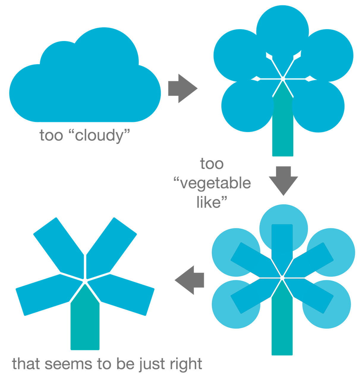
Thus, we wanted to stick with the cloud. However, clouds can be associated with cloudy or rainy days, and we wanted to find something cheerful (at least for those of us who do like to eat broccoli).
Therefore, the cloud morphed into broccoli.
The first versions of the broccoli were too „vegetable like“ – therefore it further morphed into a geometric form that build our final logo.

BlueBrocco.li – Liechtenstein
Conveniently the ending syllable of broccoli is also the country domain of Liechtenstein (.li) where we are located. This allows us to have this cool web address BlueBrocco.li. There are no additional letters such as www.company-name.com needed. Every letter in our web address is a letter from our company name! Just type bluebrocco.li in your web browser and you will end up on our webpage.
Swap the colours
In an M.B.A. marketing lesson we learned: If you want a memorable and catchy company name then take a common object (e.g. a broccoli) and change its colour if it (e.g. to blue).
At least that worked out for Red Bull we thought and went with that. It seems that there is some truth to it. We have been contacted by people who remembered our company name from a short introduction several months in the past. Some may not remember the whole name or mix it up but at least they remembered us (e.g. we heard already “ah – you are the green broccoli, right?” but even with that name, paired with “medical device consulting” google will find us).
Why blue? Again, in the M.B.A. marketing lesson, they taught us about the meaning of colours for businesses. Blue stands for technology, professionalism, and reliability. Companies with blue logos include IBM, Phillips, GE, HP, Cisco, and SAP. Here we are in good company we thought.
And from a logo perspective, the mix with turquoise creates a slight optical illusion: Did you realise that the polygon at the bottom has a different colour from the others? Some only realise that our logo includes two different colours in a second look – and after staring at it for a longer time the colours seem to merge again.
Coming up with the final logo was not a straight forward process. We created several candidates to come up with the final logo. But this is another story for another post.

